


Newton’s Animation Breakdown: How Static Design was turned into Motion

At Everything Design, our designers have been doing the challenge of daily 45-minute redesigns — quick, focused sprints to explore and sharpen their design instincts. Inspired by this, our developers recently joined in, using these concepts as playgrounds to hone our GSAP animation skills.
But here's the thing. While animating cool things is satisfying in itself, what's more important is knowing when and why to animate. Lately, I’ve been challenging myself to design animations that are not just visually slick, but narratively relevant.
Context Is Everything
Some sites just need a gentle nudge—a micro-animation here, a hover effect there. Others benefit from a bit more visual flair. And then there are pages that work best when nothing moves at all. It all hinges on context. (Nobody wants a laser show when they’re trying to hit “Add to cart.”)
A Case in Point: Newton
Newton is one of my recent recreations. The redesign was done by Athira — one of our brilliant designers — but at first glance, I was a bit confused. The design had two distinct names: Newton and Sophia.
What’s Newton? Who’s Sophia? Which sat under which?
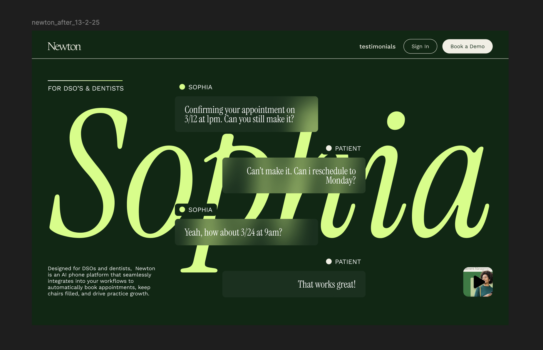
Curious, I visited the original site for more context. After a bit of a digging, I came to know that Newton is the platform, and Sophia is the AI assistant that powers it — a digital interface tailored for DSOs and dentists.
That’s when I realised the animation needs to make this hierarchy obvious: Newton is the platform, Sophia is the assistant within it.
I needed to stage it in a way that gives the idea that Newton is the platform and Sophia is the AI assistant in that platform.
And that’s when the animation direction clicked.
Designing the Animation Flow
I ran this little internal monologue:
Newton’s Sophia,
For DSOs and Dentists.
I broke the narrative into four moments:
- First, the name ‘Newton’ fades in — representing the platform. An apostrophe with the ‘s’ comes quickly after to associate Sophia as a part of Newton’s platform.
- Next, ‘Sophia’ appears — establishing her as the AI agent operating within Newton.
- Then comes the context — just a short line of copy at the bottom that explains what the platform actually does.
- Finally, the centerpiece: a chatbox appears like a product demo — not thrown at you up front, but emerging after the story is clear.
- I also added a small detail here — the patient’s message comes in with a slight delay, while Sophia replies almost instantly. It’s a subtle thing, but it quietly reinforces that Sophia is fast, sharp, and always ready.
The Result
After cooking up the animation flow, here’s the final result.
The Takeaway
My key lesson? Animations can look slick, but they must make sense in context. On B2B websites—where clarity, trust, and structure matter far more than flash—purposeful motion wins every time.
Thoughtful sequencing builds intent. It respects how people absorb information, letting the animation guide the story rather than hijack it. The goal isn’t to show off; it’s to support the narrative and keep the experience smooth and natural.
What I built here is just one approach—and that’s what this exercise keeps teaching me. Good animation doesn’t merely move; it moves with meaning.

At Everything Design, our designers have been doing the challenge of daily 45-minute redesigns — quick, focused sprints to explore and sharpen their design instincts. Inspired by this, our developers recently joined in, using these concepts as playgrounds to hone our GSAP animation skills.
But here's the thing. While animating cool things is satisfying in itself, what's more important is knowing when and why to animate. Lately, I’ve been challenging myself to design animations that are not just visually slick, but narratively relevant.
Context Is Everything
Some sites just need a gentle nudge—a micro-animation here, a hover effect there. Others benefit from a bit more visual flair. And then there are pages that work best when nothing moves at all. It all hinges on context. (Nobody wants a laser show when they’re trying to hit “Add to cart.”)
A Case in Point: Newton
Newton is one of my recent recreations. The redesign was done by Athira — one of our brilliant designers — but at first glance, I was a bit confused. The design had two distinct names: Newton and Sophia.
What’s Newton? Who’s Sophia? Which sat under which?
Curious, I visited the original site for more context. After a bit of a digging, I came to know that Newton is the platform, and Sophia is the AI assistant that powers it — a digital interface tailored for DSOs and dentists.
That’s when I realised the animation needs to make this hierarchy obvious: Newton is the platform, Sophia is the assistant within it.
I needed to stage it in a way that gives the idea that Newton is the platform and Sophia is the AI assistant in that platform.
And that’s when the animation direction clicked.
Designing the Animation Flow
I ran this little internal monologue:
Newton’s Sophia,
For DSOs and Dentists.
I broke the narrative into four moments:
- First, the name ‘Newton’ fades in — representing the platform. An apostrophe with the ‘s’ comes quickly after to associate Sophia as a part of Newton’s platform.
- Next, ‘Sophia’ appears — establishing her as the AI agent operating within Newton.
- Then comes the context — just a short line of copy at the bottom that explains what the platform actually does.
- Finally, the centerpiece: a chatbox appears like a product demo — not thrown at you up front, but emerging after the story is clear.
- I also added a small detail here — the patient’s message comes in with a slight delay, while Sophia replies almost instantly. It’s a subtle thing, but it quietly reinforces that Sophia is fast, sharp, and always ready.
The Result
After cooking up the animation flow, here’s the final result.
The Takeaway
My key lesson? Animations can look slick, but they must make sense in context. On B2B websites—where clarity, trust, and structure matter far more than flash—purposeful motion wins every time.
Thoughtful sequencing builds intent. It respects how people absorb information, letting the animation guide the story rather than hijack it. The goal isn’t to show off; it’s to support the narrative and keep the experience smooth and natural.
What I built here is just one approach—and that’s what this exercise keeps teaching me. Good animation doesn’t merely move; it moves with meaning.


